Amidst the chaos off setting up your cake shop business you knew you needed to have a website.
After a quick Google search you ended up on Wix or Squarespace and started designing your site.
You list our your products, add a few images, and write out your story of why you started this business and then declared your cake shop website done and moved on to other important tasks.
If this story sounds familiar you’re not alone.
I’ve reviewed hundreds of cake shop websites and by far this is exactly what many of them look like. Creating a good looking website that converts is difficult work and likely something you just don’t have the time or expertise to pull off.

But your website is one of your most vital salespeople.
It showcases exactly what you do and is meant to convince people that your the right cake shop for them to use. Your website is also your central hub for launching many of your cake shop promotion ideas.
In this article I’m going to break down what the best cake shops are doing on their websites and address some common pitfalls I see. Then if you’ll apply just a few of the things listed here your website will start working harder for you.
Poor Product Photography
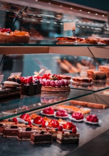
Far too many cake business websites have low quality photography.
The lighting is poor, the photos look grainy or the counter has other things on them in addition to the cake (and I’m not talking decoration).
As a cake shop, it pays to invest in high quality photography. If you aren’t confident in your own photo skills, consider hiring a photographer to come spend a few hours at your business taking pictures you can use in your marketing and on your website.
Product Pages with No Photography
If you list out the products you offer you should actually include some images. Many cake shops have a page listing all of their products and zero images.
I’m not saying you need pictures of everything. That just doesn’t work. But you should at least include a few images in order to show people what they’re buying.
Showcase Custom Cakes
If custom cakes are a big part of your business you should showcase your work. Include a gallery of customer cakes you’ve created to show people exactly what you’re capable of creating for them.
When you do this you give people who aren’t sure what they want ideas.
Now they can point to a cake on your website and say, “I want it to look similar to this but with a different color scheme, style, etc.”
A none website tip: you can do the same thing in your store. When a couple comes in shopping for a wedding cake you can hand them an iPad and they can swipe through all of the custom wedding cakes you’ve created.

Pictures of your Store
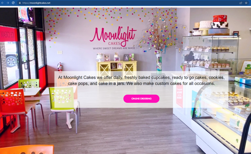
If you have a storefront, make sure to include pictures of your store on your website. Showcase the outside, inside, and your products on the shelves in your store. Maybe even a picture of you and/or your team.
Show customers what to expect when they come to visit. It will help to establish legitimacy and also invite them to come see for themselves.
Design for Mobile View
Many of the cake shop websites I’ve reviewed were clearly designed for the desktop viewer. But I can almost guarantee most of your visitors are finding you on mobile.
They’ll reach your website from Instagram or Google maps and when using either of those they’re almost always on their phone.
So test your website on mobile. Make sure all of the menus look right and the page structure makes sense. Sometimes pages with lots of columns will look great on desktop but when put in mobile they end up all out of order.
Your mobile site is vital so don’t ignore it.
Make it Clear What You Do
While this article is about cake shop and desert shops in general, they clearly aren’t all the same.
Some specialize in custom cakes only and don’t do other things like cookies or cupcakes. While others are shops that have many cookies and treats that are made every day and ready for people to walk in and buy at any time.
Many cake shop websites don’t make it clear what exactly they specialize in.
If your a cookie business, make that clear with your main headlines. Call yourself Fort Worth’s Favorite Cookie Shop in the headline and make your cover image of cookies.

No Clear Call to Action on Homepage
When people land on your homepage what action do you want them to take?
If you specialize in wedding cakes it may be that you want them to view an inspiring gallery of your work to show them what you could create for them.
Or it may be that you want them to book a consultation call to figure out if your a good fit for their needs.
If you’re a cookie business maybe you want them to order a box of cookies online so you bring the order button to the top of the homepage and make that really easy to find and click.
I can’t tell you what the right action is for your business but I strongly recommend you design your home page with a specific call to action in mind.
Using a Facebook Page as your Cake Shop Website
I’m surprised how many businesses use Facebook as their cake shop website. While yes, you can certainly run a business from a Facebook page, it comes across as far more professional once you have your own website.
Creating your own website is a fairly straightforward process and there are many tutorials on how to do it.
Personally, I’d set up my website on Squarespace. It’s cost effective and really easy to create. Just select your favorite theme and customize it with your business info.
Well there you have it, those are some of the basic ways cake shops are messing up their websites. Have any questions? Be sure to drop them in the comment section below.
And if you need more help with your shop, be sure to take a look at these cake shop marketing ideas.


Leave a Reply